ACUITY SCHEDULING

PROJECT INFO
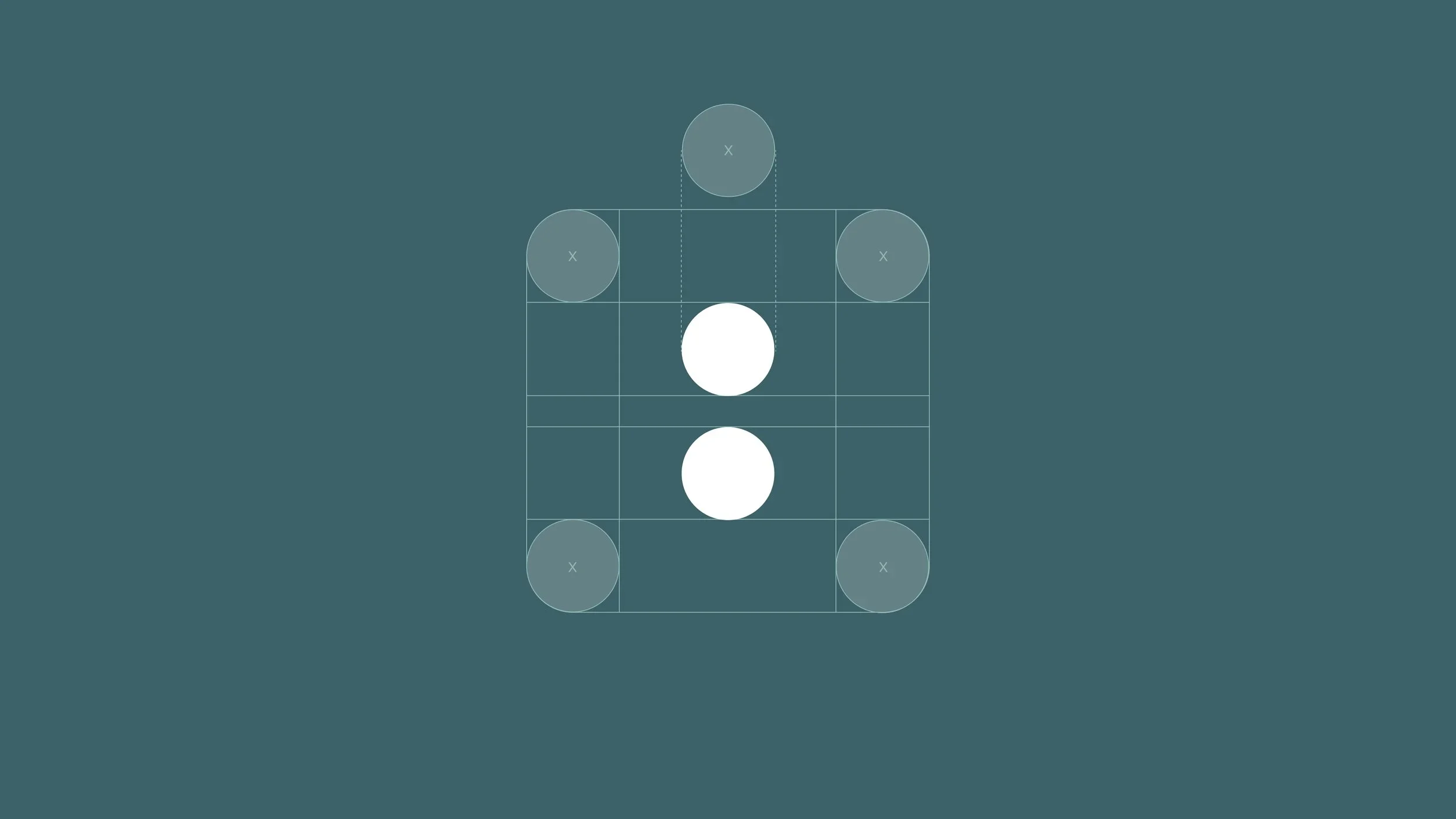
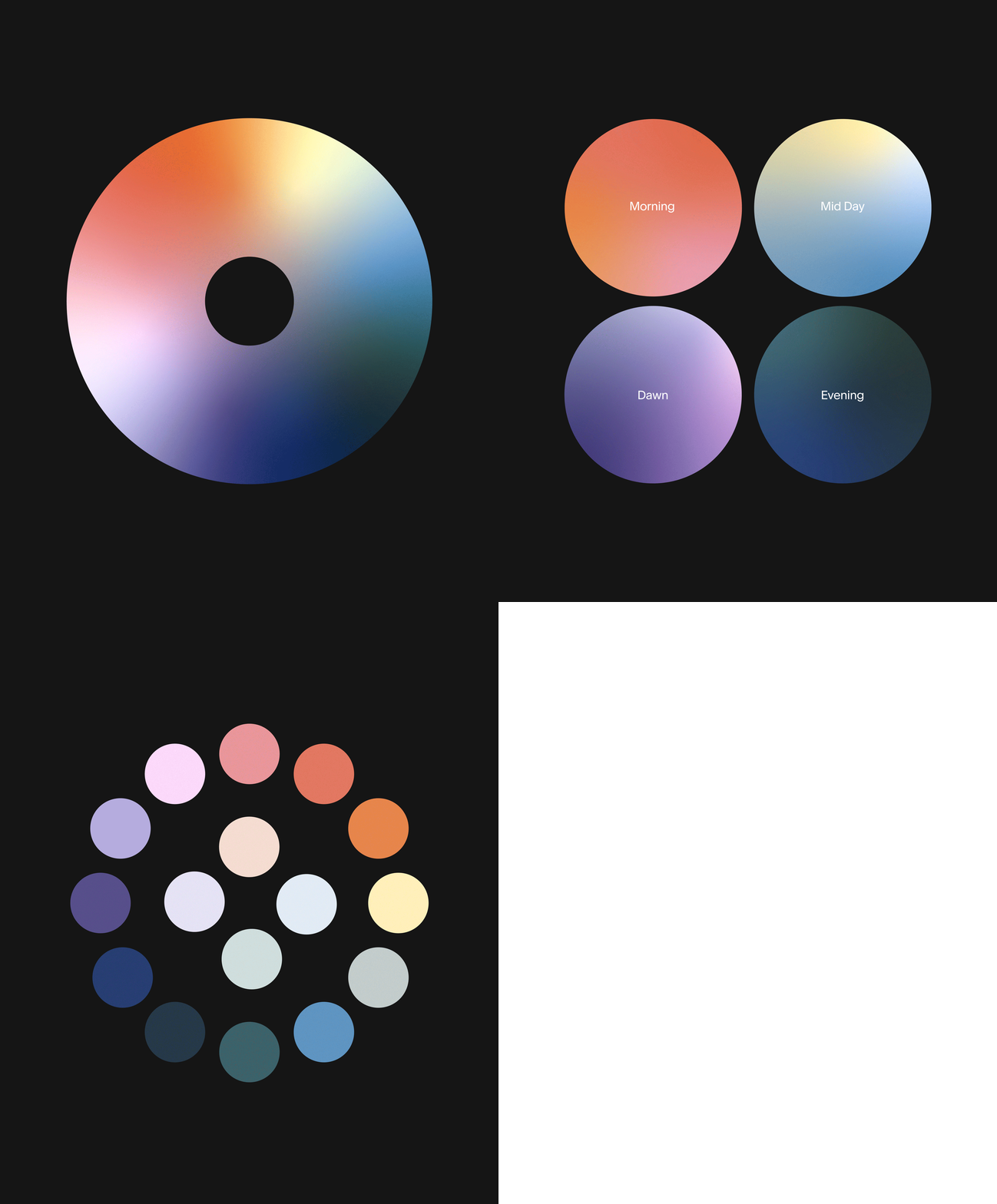
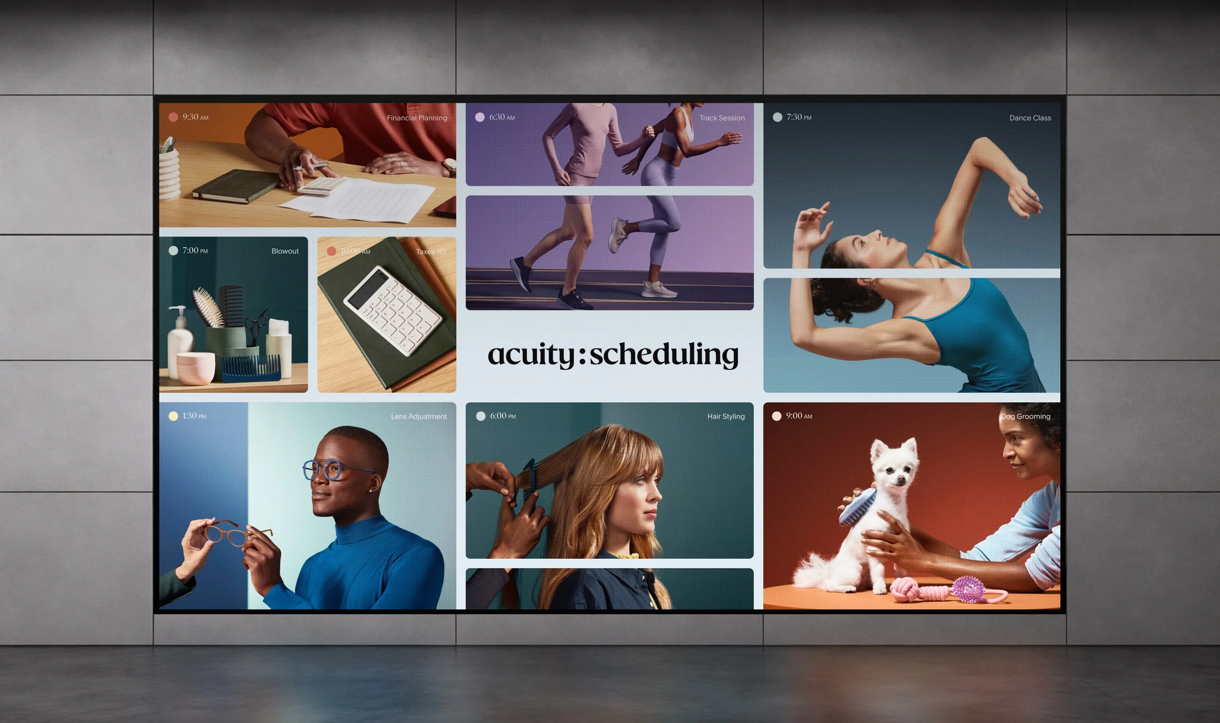
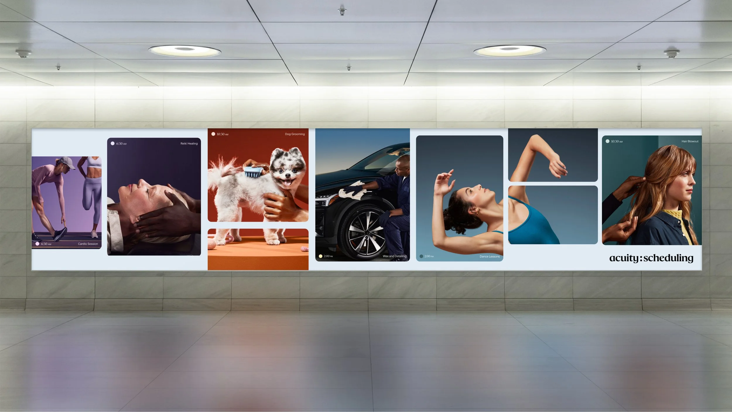
Brand identity, design and art direction for a customizable scheduling application. Our visual system was inspired by the universal icon for time, a colon, mapped to various key gradients and times of day. This dynamic palette is also representative of the diversity of businesses serviced on the platform, and responds intelligently to meet customers in real time.

DISCIPLINE
Brand, ART DIRECTION

YEAR
2024

Dark background with white text that reads 'acuity: scheduling'.
Diagram of a backgammon board with dice and checkers in different positions.
Acuity Scheduling color animation
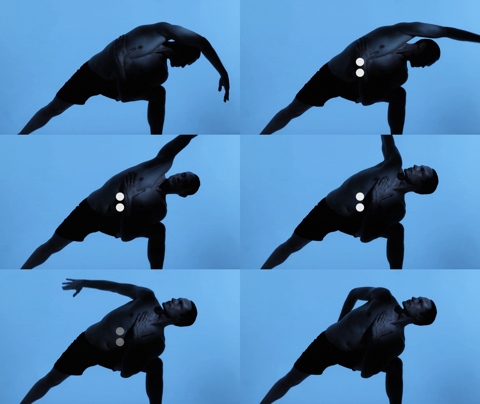
Silhouette of a person in athletic wear performing a yoga pose against a blue background.
Close-up of a smartphone screen displaying various app icons including Calendar, Photos, Contacts, Clock, Home, and others.
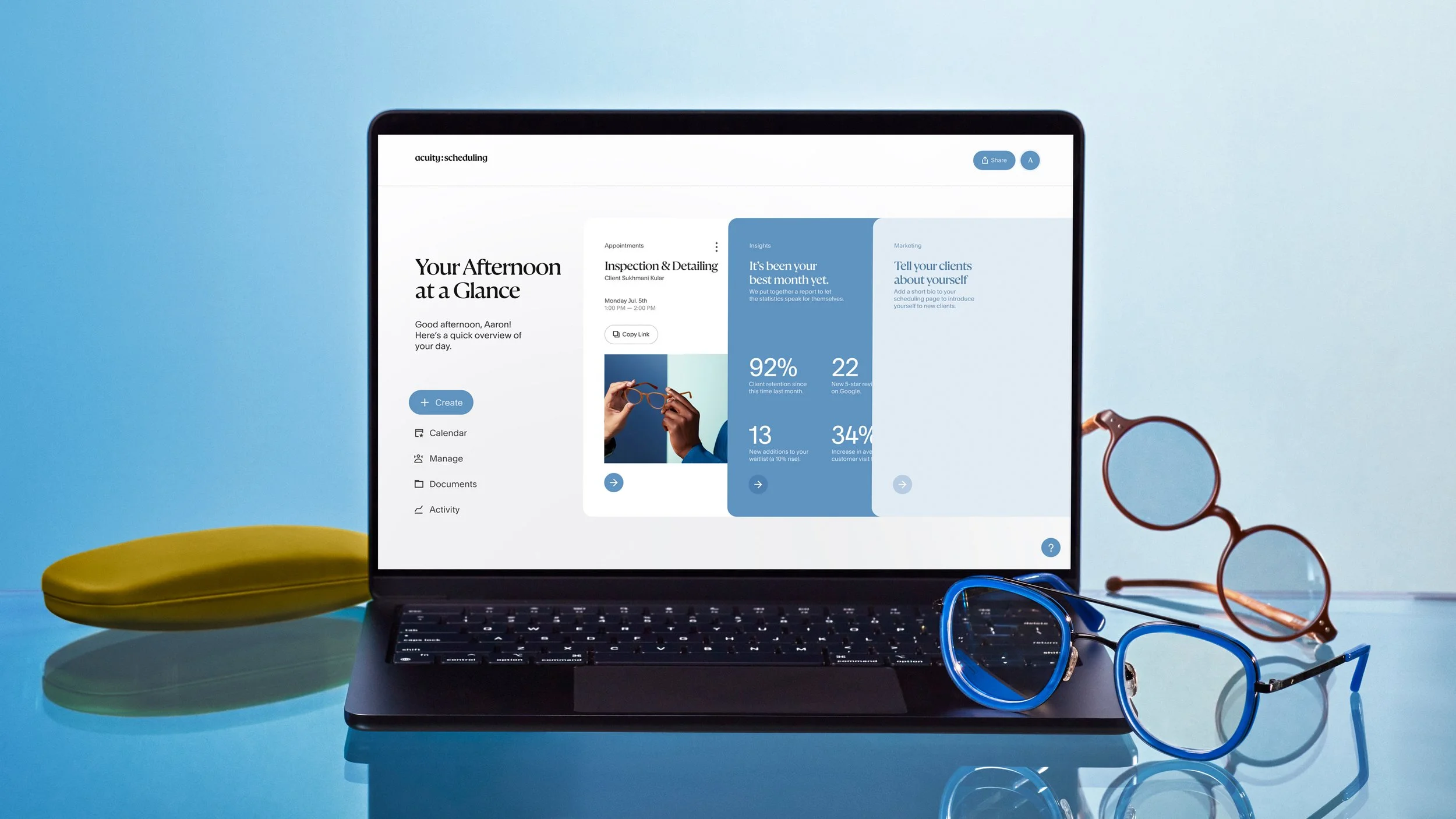
A laptop showing a scheduling and analytics app on a blue surface, accompanied by two pairs of glasses, a yellow glasses case, and a blue glasses frame.
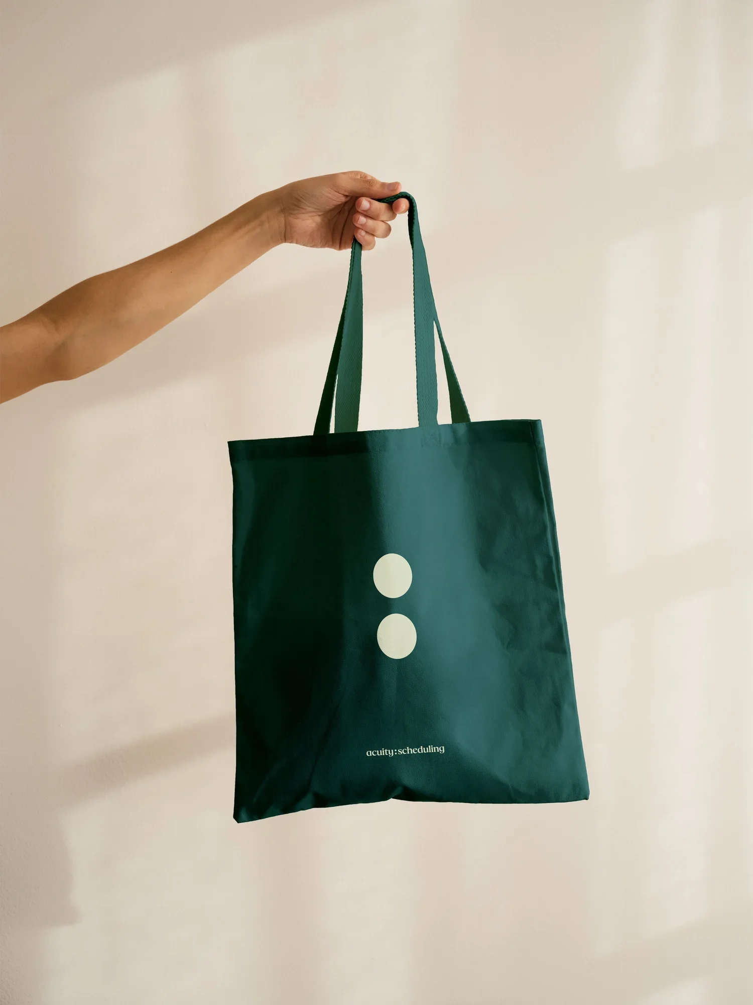
Hand holding a green tote bag with two white circles and small white text.
Two women in athletic clothing using smartphones in a gym setting with exercise equipment in the background, including a yoga mat and fitness ball.
Two people meeting in an office, one using a laptop for scheduling, with a notebook, glass of water, and calculator on the desk.

CREDITS
CREATIVE DIRECTOR: SATU PELKONEN
SENIOR PRODUCER: SION PRYS
DESIGN MANAGER: ALBERT CHANG
SENIOR DESIGNERS: ROBBIE REYNOLDS, MIKKI JANOWER
MOTION DESIGN MANAGER: VIDEL TORRES
STAFF PHOTOGRAPHER: CRAIG REYNOLDS

MADE AT SQUARESPACE
WITH OPTIMO TYPE FOUNDRY